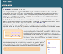
Bubbly Theme

Image Overhaul

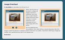
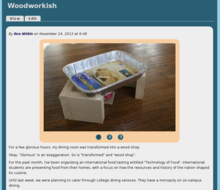
The big slideshow used priorWhen I set this site up, I decided to collapse all images used into a slideshow. Each post has a couple relevant images attached, which show up in a teaser slideshow on the mainpage and as a large image within the article. 

But the slideshow had two problems. First, when writing a step-by-step piece (like this), images couldn't be placed in a relevant section of the text. For a while, I resorted to referring to images by number, but I wanted pictures next to the relevant text. 
Superfish Theming

.sf-menu li:hover > ul,
.sf-menu li.sfHover > ul {
  left: 0;
  top: 1.77em;
}
 
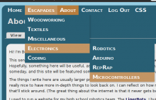
That little snippet of code's been giving me grief for a month. Well, this one, really:
/*Adjust top to line up submenu with shorter main menu*/
.sf-menu li:hover ul,
.sf-menu li.sfHover ul {
  top: 2em;
}
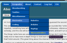
When I set this site up, I wanted dropdowns. Y'know, menus that expand when you hover them. They were initially provided by Nice Menus. For some reason, some time later (and no, I don't know why), Nice Menus stopped being nice. The dropdown's wouldn't drop. 

Searching for a Theme

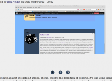
I have nothing against the default Drupal theme, but it's the definition of generic. It's like using Helvitica (an intentionally generic font) to brand your business. With that in mind, I set out to find a more interesting theme for this site.

My brother and I browsed through the Drupal theme repository, but didn't find much we liked. Alpine, the best theme we saw, had a promising layout, but carried an outdoors motif. We tried to refit the images, but the theme wasn't designed to be modified. A surprising number of the themes are starter kits, and those that aren't tended to be clean and businesslike.

Perhaps it's fitting that we didn't find any perfect themes online.