By Ben Nitkin on
I have nothing against the default Drupal theme, but it's the definition of generic. It's like using Helvitica (an intentionally generic font) to brand your business. With that in mind, I set out to find a more interesting theme for this site.
My brother and I browsed through the Drupal theme repository, but didn't find much we liked. Alpine, the best theme we saw, had a promising layout, but carried an outdoors motif. We tried to refit the images, but the theme wasn't designed to be modified. A surprising number of the themes are starter kits, and those that aren't tended to be clean and businesslike.
Perhaps it's fitting that we didn't find any perfect themes online.
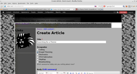
Last night, I decided to create a custom theme using the Zen framework. This morning, I changed the theme to use a fixed layout (to make things easier on my brother, the artist). I also installed a variety of background images for him to customize: a background, a header, a menu, a repeating sidebar, and a footer (image 1).
Update 1: It's surprising how little it takes to completely revise a theme's CSS. Zen is an incredible engine to work with. Even moving the header into the sidebar was comparitively easy! My brother went through and set up some images for the borders, and I swapped background images around. Now, the theme looks completely different.
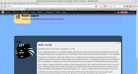
Update 2: This morning, I replaced all of the images with CSS for a lighter site (image 2). I also started looking around at other pages to make the theme more consistent. The header lives in the sidebar now, and the admin pages are becoming readable.
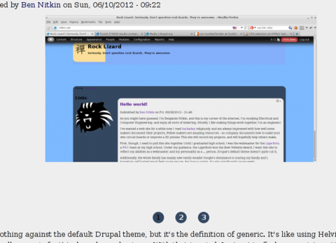
Update 3: It's amazing how powerful CSS is. I just themed a simple pager into something pretty. It started off as the text 123, with each number linking to an image. Now, the text is centered, surrounded by a bubble, and indicates which image is being shown! (image 3)
This is becoming unwieldy. Time for a new post.


