By Ben Nitkin on
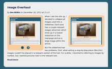
 When I set this site up, I decided to collapse all images used into a slideshow. Each post has a couple relevant images attached, which show up in a teaser slideshow on the mainpage and as a large image within the article.
But the slideshow had two problems. First, when writing a step-by-step piece (like this), images couldn't be placed in a relevant section of the text. For a while, I resorted to referring to images by number, but I wanted pictures next to the relevant text.
Now, content in Drupal is stored in fields. The body of every post is a field; images are stored in another field. Rendering is set per-field. For instance, I can show images in a slideshow, all at once, or embedded. But not mixed.
 To save myself from changing every post I've written, I created a new field. The old one displays images as a thumbnail slideshow on the frontpage and a larger slideshow on the article itself. The new one maintains the frontpage slideshow, but does away with the larger slideshow. Instead, images are inserted in-text, wherever I want them.
For some posts, images on top versus in-text doesn't matter. But many of the topics here are step-by-step, and showing images next to the relevant part of text helps article flow.
 The new layout introduces a slight problem, though. If there are images before the teaser break, they'll show up on the main page, compete with the slideshow for space, and look odd. A simple CSS rule, though, can suppress inserted images on the main page.